My Role
UX Designer
Year
2019 - 2020
Team
UX Design team
Product Manager
Full-Stack Engineers
QA Engineer
Problem
Cisco's ISE is a major game-changer for enterprises looking to enforce compliance, enhance infrastructure security, and streamline their service operations with 10,000 global customers, faces usability challenges due to two issues:
A disconnect between developers and UX designers leads to prototypes not aligning with final features. Despite efforts for a UX review after each feature's development, limited time results in multiple reviews, often unsuccessfully aligning the final product with the intended design.
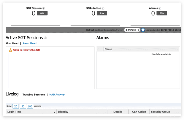
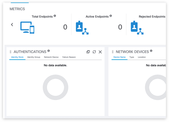
Inconsistency within the ISE interface hinders user navigation. Customer feedback has emphasised this confusion and difficulty, impacting daily work and user experience.


Inconsistency in UI
Addressing these issues is vital for improving user experience and enhancing Cisco's reputation.
Impact
The navigation and search experience improved, resulting in a 56% decrease in the average time spent searching for a feature.
One piece of feedback received: "The best part is the GUI, which is absolutely user-friendly and simple to use for all daily management activities or to modify existing configurations."
The product's consistency improved, leading to increased user satisfaction.
A design system was established for the entire product, which simplified the development process and feature addition.
Outcome
Modernizing a global enterprise platform that manages access control and policy enforcement for thousands of users.
The complete product redesign at the framework level brought consistency to each page, which made the development of new features quicker.
Misalignments between designers and engineers decreased because everyone was working with the same design system.
Improvements to the navigation and search experience were well-received by our partners, and we received great feedback on these changes.
Updated Dashboard and Navigation
CONSTRAINTS
Due to a lack of engineering and time resources, we initially had to focus on high-level changes at the framework level without altering the architecture and backend.
Dashboard makeover
The dashboard has become cleaner and more contrasting. Important information is now highlighted, data visualization has improved, and it passes accessibility checks.
New Dashboard
Improved navigation
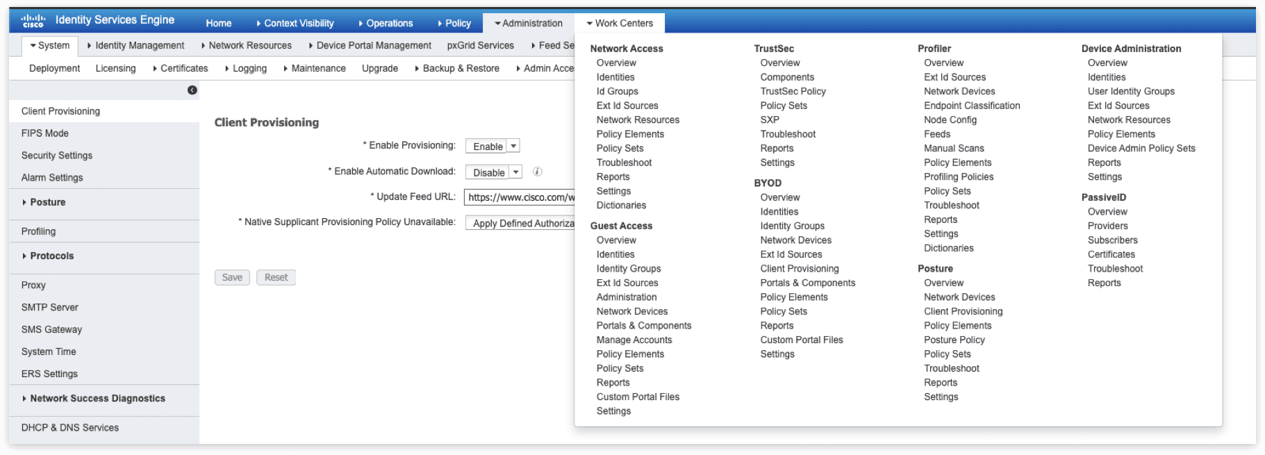
ISE featured a large mega menu with six levels of navigation, encompassing every page and feature in the product. However, our user research indicated that users don't need all this information simultaneously and tend to spend most of their time on the same pages.
Instead of using a mega menu, we opted for a fullscreen format. This allows users to easily switch between top-level items and view child items clearly. Everything is logically organized and quickly accessible.
We've added a significant feature, the "Recent Pages" section. This makes it easier for users to visit their most frequently accessed pages. Unfortunately, we were unable to implement the "Save Page" feature at this time.
Old navigation
New navigation
We have also introduced a smart search function, which was previously missing in ISE. This function organizes the results from all six levels of navigation, providing breakdowns for each top level.
New search
Bar and breadcrumbs
The old navigation bar, although it displayed the nesting, was confusing and contained excessive information. We proposed to display only location-based breadcrumbs, indicating the user's position within the site's overall hierarchy.
Old and New navigation
Tables
Tables have become clearer and more adaptable to user needs. In the previous implementation, the search function was limited to individual columns. We've now combined search and filter interactions to make the process faster and more straightforward.
Old and New table
The filter allows the user to sort the data table according to their needs using "AND" and "OR" attributes. The "AND" attribute operates within the tag and filters the table based on all names simultaneously. If the user wants to use different titles, the "OR" attribute will be activated to find any one of the titles.
New table filter
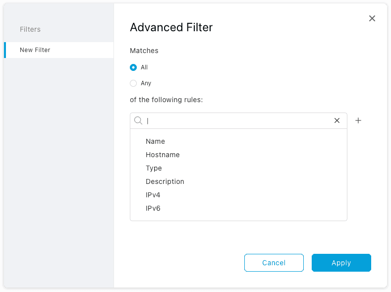
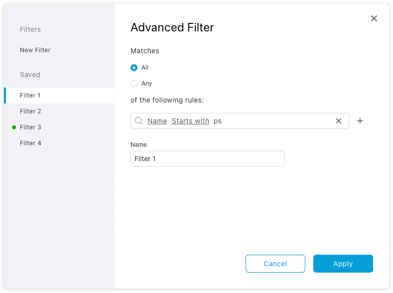
In addition to the "AND" and "OR" attributes, the user can utilize more advanced tools. With the Advanced filters, the user can create complex filters and save them for future use.
Advanced filters
Page Layout
With just a few adjustments to the basic components, pages can look cleaner and more user-friendly.
Old and New page layout
Despite facing technical limitations and having a small team, I am proud that we initiated this redesign and managed to kickstart the process. Although we didn't deliver the best experience initially, we made small strides towards our ultimate goal of improving the product at all levels.
The introduction of the design system significantly transformed our workflow, making later iterations more manageable.
Our customers well-received the new style, expressing their pleasure in seeing some refreshing changes.

