
Skip to content

Anastasiia Bondarchuk

Easy Lens Mobile Redesign

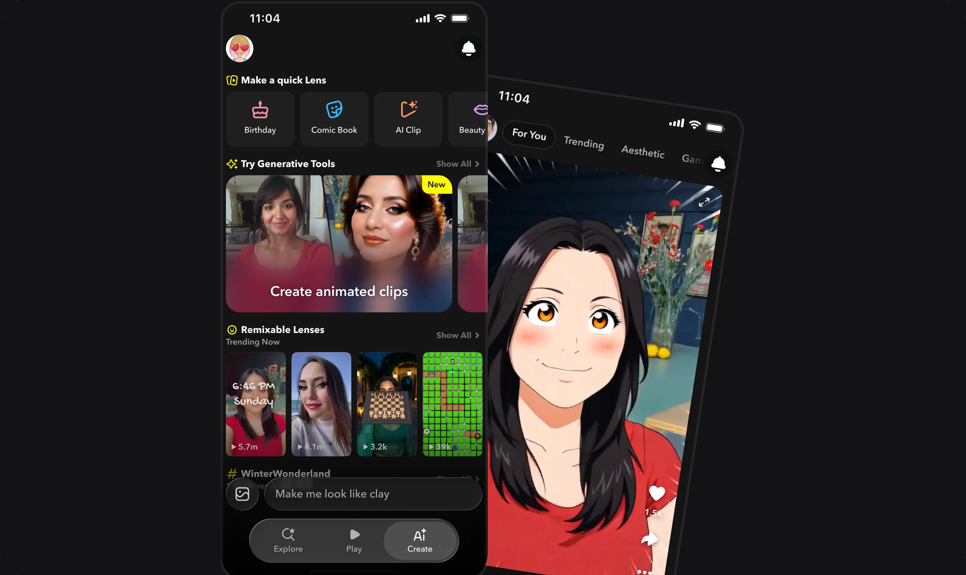
The Create tab, with quick Lenses, generative tools and remixable Lenses, next to a Lens playing in the Play tab.

Easy Lens Mobile Redesign

2025–2026
Shipped after I leftResearch → shipped iteration
Role
Mobile V1 was another designer's. I joined at V2, worked on the chat with the designer who started it, and took over when she left, and was the sole designer on mobile from then. I redesigned the navigation and Create page (shipped after I left), then designed a hybrid Create screen, which also shipped after I left.
Team
PM, engineering lead and UX researcher
Timeline
2025–2026 · Redesign shipped summer 2026
Outcome
Redesign shipped after I left · Hybrid Create screen shipped after I left

A Lens is an effect you play with in the Snapchat camera, like dog ears or a new background.

On mobile, creating a Lens started from a bar at the bottom of the feed. Research showed people didn't see it as the way in. I explored where creation should live and redesigned the app around a dedicated Create tab. Then I designed the Create screen itself and brought back direct control over components.

Starting point: mobile V2

Creation started from a bar in the feed.

Not my design, shown as the starting point. Recreated interaction, sample data.

Chat-based creation came to phones at V2, in late 2025. The app was one vertical feed. You watched a Lens, tapped a "Create me" bar and described the change in words. The feed, publishing and the profile were already designed.

Problem

People didn't see the bar as the way to create.

Research showed this. And as Lenses got more varied, with games, quizzes and interactive Lenses, one feed with chat-only creation started to feel limiting.

The team and our UX researcher brought the research and the goal: make creation easy to find, and give it room to grow. The answer was mine to explore.

The redesign

A named tab says "creation lives here."

Where creation lives

Options
I explored several navigation models. Some kept one main surface and added a yellow + button for creating. It sat on the right of the bar, in the center, or with the bar reshuffled around it. Others split the app into tabs with a dedicated Create page.
We chose
Tabs, as a team, with our PM and engineering lead.
Why
A + button is easy to see but doesn't say what it does, which was the exact problem research found.
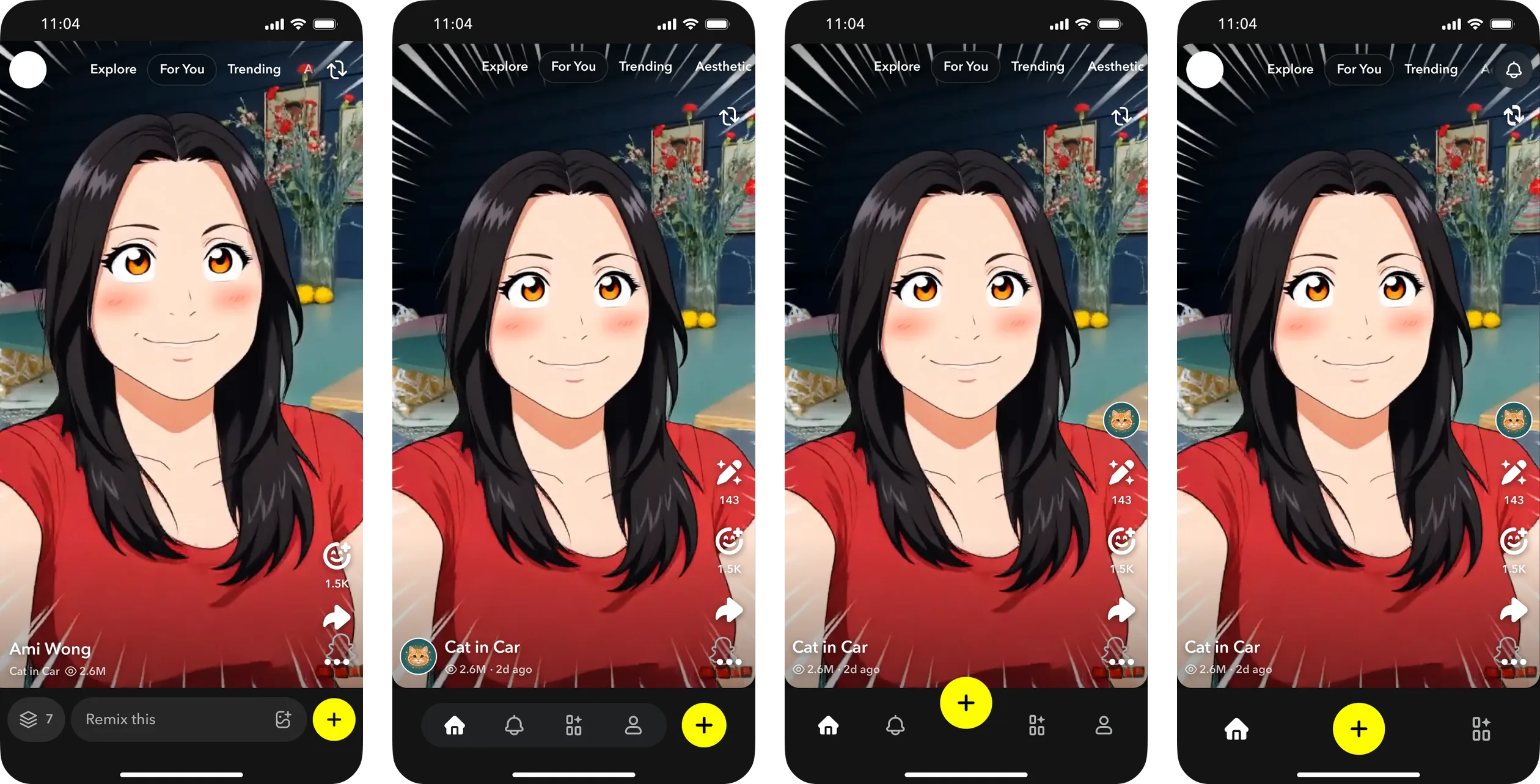
Four versions of the app's bottom navigation, each with a yellow + button in a different position.
Shown with sample data.Exploration

What shipped

The app splits into three tabs:

ExploreBrowse and search Lenses.
PlayWatch a Lens full-screen, with a labeled "Remix Lens" button to build on it.
CreateA home for creation, opening with categories, generative tools and a prompt.

The hybrid Create screen

Chat for creating, components in their own place.

Why

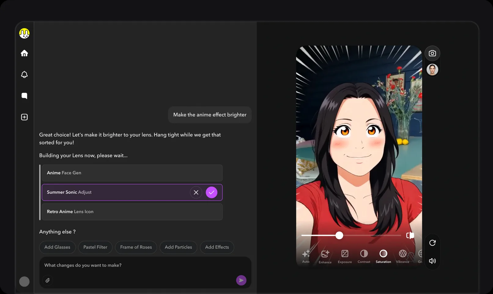
V2 chat, which I worked on with the designer who started V2. Recreated interaction, sample data.

Once creation had its own place, the Create screen itself was the next problem. V1 was built from components. Creators had full control, but did everything by hand. V2 was chat. It was easy to start, but the components the AI generates sit inside the conversation. On a phone, they scroll away with the chat and are hard to find and fine-tune.

I started this exploration on my own, after we kept discussing in team meetings how to improve the editing. The team wanted to explore the same idea on web too, but mobile needed it more, because editing on a phone has to be easier.

Two directions

Both directions let you select elements on the preview. They differ in how the components are listed.

Explored, not taken forward
A · Grouped componentsSimilar components share one label, such as Assets, Interaction or Text. Tap a label to see its components, then style one with its own tools.
Shipped after I left
B · One listKeep the V2 chat and add a component panel, opened from a layers icon. Every component sits in the list on its own, and you edit it directly, such as its color, saturation or opacity.

The decision

Options
Group similar components under shared labels, or show every component in one list.
We chose
B, as a team, with our PM and engineering lead.
Why
It was easier to build. It adds a panel to the existing chat instead of rebuilding the editor, so it could ship sooner.
The cost
Similar components aren't grouped under shared labels.

Preview and Edit

I added two modes to the Create screen. The main reason was games and other interactive Lenses, which need a screen you tap to play, not to edit. Before, the preview and the chat also shared one screen. You swiped the chat away to see the Lens, which wasn't obvious or easy.

PreviewThe Lens plays as people will see it. You can't edit here.
EditSelect elements right on the preview and change them.

Explorations

People need a starting point.

Design exploration. Recreated interaction, sample data.Concept

The blank prompt

A blank prompt is the hardest part of an AI tool. I explored two modes under one toggle: Freestyle, where you describe anything, and Guided, where you pick a type of Lens and a genre and the prompt builds itself. The toggle stayed an exploration. The shipped Create page carries the idea instead, by opening with categories and tools.

Outcome

The redesign shipped largely as I designed it.

The redesign shipped in summer 2026, after I left. The hybrid Create screen shipped after I left.

Other case studies

Cisco Social Login Builder

Setting up social login for guest Wi-Fi in Cisco ISE meant hopping across a huge console. I designed a guided builder beside it.

BacklogEnterprise complexity